-
Courses
Courses
Choosing a course is one of the most important decisions you'll ever make! View our courses and see what our students and lecturers have to say about the courses you are interested in at the links below.
-
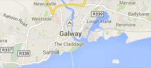
University Life
University Life
Each year more than 4,000 choose University of Galway as their University of choice. Find out what life at University of Galway is all about here.
-
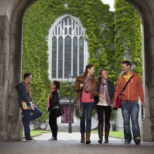
About University of Galway
About University of Galway
Since 1845, University of Galway has been sharing the highest quality teaching and research with Ireland and the world. Find out what makes our University so special – from our distinguished history to the latest news and campus developments.
-
Colleges & Schools
Colleges & Schools
University of Galway has earned international recognition as a research-led university with a commitment to top quality teaching across a range of key areas of expertise.
-
Research & Innovation
Research & Innovation
University of Galway’s vibrant research community take on some of the most pressing challenges of our times.
-
Business & Industry
Guiding Breakthrough Research at University of Galway
We explore and facilitate commercial opportunities for the research community at University of Galway, as well as facilitating industry partnership.
-
Alumni & Friends
Alumni & Friends
There are 128,000 University of Galway alumni worldwide. Stay connected to your alumni community! Join our social networks and update your details online.
-
Community Engagement
Community Engagement
At University of Galway, we believe that the best learning takes place when you apply what you learn in a real world context. That's why many of our courses include work placements or community projects.


 Accessibility & Language
Content Box
Interactive Demo
Colours
Content boxes allow you to have a H3 title (white, with a choice of 12 background colours), followed by normal coloured text (as demonstrated here).
Colour choices are:
Lime Green,
Spring Green,
Orange,
Purple,
Maroon,
Dark Maroon,
Dark Pink,
Aqua-Marine,
Blue,
Light Gray,
Ash, and
Black.
Alternatively, you can make the entire content box use that background colour. The text colour will change to ensure readability - white text on dark background colours, and black text on bright background colours. Lime Green, Spring Green, Orange, Purple, Maroon, Dark Maroon, Dark Pink, Aqua-Marine, Blue, Light Gray, Ash, and Black.
Content box with a Block Background Colour
We are using a aqua-marine header in this box and we have also ticked the checkbox for 'Block Background Colour', which applies that header colour to the entire content box.
We have selected a box size of Auto here.
We strongly recommend you select the 'Auto' box size setting, to avoid any page rendering issues that can result from choosing the wrong setting.
Note: You change a page's width (and other options) using its section's DC.Keywords field - see my interactive demonstration for full information.
More Information and examples
Box Sizes
Content boxes can be set to 'Auto', to fill the available space on the page. This is the recommended setting.
They also allow you to select the box size (1-4). This is a legacy from a much older website template.
A size of 1 is roughly equivalent to a quarter of the content width, when the page has a left navigation bar and no right-bar. If your page has a left navigation bar and a right-bar, there's roughly room for a width 3 content box - but you're safer to use the 'Auto' setting, to fill up the entire available width.
This content box is set to auto and it has an ash grey header.
Adding a content box of size 1 or 2 creates a left-justified data island. Because it does not take up the full width of the page, all other content (that hasn't been explicitly styled to be a specific width) will appear to its right.
You might be tempted to try to float this data island to the right but this is not supported (you should use a '3D Content Panel' for this instead).
These sized boxes were originally designed to fill up available space from the left and are sometimes useful if you already have a foreground image in the body area of the page that is aligned right or left.
However, because text can appear beside them, when they don't fill the entire page width, setting a specific size can can cause more problems than it solves. This is why we recommend the auto setting.
Content box number 2
This content box has a purple header and a box size of two
Content box number three
This content box has a box size of one and a light grey header.
Notice how the header wrapped onto a second line rather than expand wider than the box size allows.
Content Box 4
This is just an extra content box to ensure that text, from lower down the page, does not appear here.
Any space, to the right of (or underneath) the right-most content box is un-reserved, so text you expect to appear lower down the page can appear there.
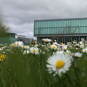
Large Content Box with Image
The 'Large content box with image' is a completely separate content type. As you can see, it has a white background and uses normal coloured text. There is no option to change its background colour.
An image is required - this always appears on the left hand side.
You can use any 'Background image / Image Path (CSS)' - in the media library.
Tip: More than 50% of visitors use mobile devices (in portrait orientation), so ideally your image should never be greater than 176px wide.
Accessibility Considerations
- If a content type requires a 'Title', never leave it blank (by entering ' ' instead of some text) - this creates unwanted vertical whitespace and, more importantly, hinders people who rely on accessibility tools such as Screen Readers.
- The headlines that are created by the 'Content Box' content type are H3s - so make sure you have a H2 in your page before you use it. The easiest way to do this is to use a 'Content (Rich Text)' and place it above your content boxes.