-
Courses

Courses
Choosing a course is one of the most important decisions you'll ever make! View our courses and see what our students and lecturers have to say about the courses you are interested in at the links below.
-
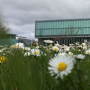
University Life
University Life
Each year more than 4,000 choose University of Galway as their University of choice. Find out what life at University of Galway is all about here.
-
About University of Galway
About University of Galway
Since 1845, University of Galway has been sharing the highest quality teaching and research with Ireland and the world. Find out what makes our University so special – from our distinguished history to the latest news and campus developments.
-
Colleges & Schools
Colleges & Schools
University of Galway has earned international recognition as a research-led university with a commitment to top quality teaching across a range of key areas of expertise.
-
Research & Innovation

Research & Innovation
University of Galway’s vibrant research community take on some of the most pressing challenges of our times.
-
Business & Industry

Guiding Breakthrough Research at University of Galway
We explore and facilitate commercial opportunities for the research community at University of Galway, as well as facilitating industry partnership.
-
Alumni & Friends

Alumni & Friends
There are 128,000 University of Galway alumni worldwide. Stay connected to your alumni community! Join our social networks and update your details online.
-
Community Engagement
Community Engagement
At University of Galway, we believe that the best learning takes place when you apply what you learn in a real world context. That's why many of our courses include work placements or community projects.


 Accessibility & Language
Table of Contents
The 'ToC' Content Type
The 'ToC' enables 'page navigation'. It can appear on the right-hand-side of the page or else under the left navigation bar (your 'site navigation'). It:
- Automatically scans the current page for headings (H2 - H6) and creates a vertical, indented list.
- Indicates where you are in the page, as you scroll through it.
- Enables site visitors to jump to any heading with one click.
This content type is particularly useful for long articles or instructive web pages, where the 'accordion' content type was not used. It lists every heading in the page.
Note: The 'Sticky Page Nav' is a similar content type, also built for page navigation. It allows you to limit which headings will appear as links (e.g. only H3's) and it creates a horizontal bar, instead of the ToC's vertical one.
Scrolling
The table of contents:
- Stays on the screen as you scroll down the page
- Auto scrolls (so you can see the bottom entries, if they don't all fit on the page)
Indentation
The 'ToC' will show every level of heading that appears on the page, below the page title, which is a heading 1. So typically, it displays links to every heading 2, 3, 4, 5, and 6 you add to the webpage.
Because these headings are hierarchical, it indents them a little to make it more obvious how they relate to one another.
Colour
Links
Each segment of the page begins with a headline and contains all the text that appears between that headline and the following one (or the bottom of the page, in the case of the last headline).
When any part of a page segment is visible on the top third of the screen, the link to that segment, in the table of contents, will be maroon with a bold typeface.
Otherwise, the link will be a grey and non-bold.
'ToC' Background
The table of content, itself, can either have a white background or else use the same shading as the left navigation bar.
You can also add a grey border - just like the one on the left navigation bar.
Note: This border can be enabled without switching on shading, to create a white ToC with a light grey border.
You can see how these options look, at the bottom of this page.
Visibility
As you scroll down the page, from the top, the table of contents will scroll into view fully. Once fully visible, it will remain on the screen, as you scroll further through the page's content. Because it's a Page Navigation feature, it will only scroll off-screen when some Site Navigation needs to scroll into view.
This means that the ToC's size can be no bigger than the available height on your screen. If the headings it lists require more space than this, the ToC will become scrollable (with a scrollbar appearing on its right). As you scroll through the page, any headings that are not currently visible on the ToC will auto-scroll into view.
Placement
The table of contents appears on the site layout's sidebar. This can appear on the right-hand-side of the page or else on the left-hand-side, under the navigation bar.
If you have a long menu, as with this example page, it is far better, from a Users' Experience point of view, to make the table of contents appear on the right.
On Small Screens
Be aware that sidebars only appear as right-bars if you have a physically wide screen - if the screen is less than 1000 pixels wide (i.e. most phones & tablets in portrait orientation), the 'ToC' will appear at the bottom of the page instead of the right or left.
Forcing a right-bar on wide screens
You can tell the 'ToC' Content Type to always appear on the right-hand-side of the page. In this case, it will auto-configure non-customised webpages to make room for the right-bar.
There is no need to manually configure your page to show a right-bar, as the content type will do it for you.
Please Note: If you've used Page Customisation Keywords to make your page widescreen, or ultra-wide, the side-bar, and your 'ToC', will appear at the bottom of the page - not on the right.
Usage
Creating Headings
Headings are sometimes added to your page automatically.
Every page get's a Heading 1 automatically - this is the section's name. Accessibility rules say that there should only ever be a single Heading 1 on a page, but you can have multiples of all the other levels - you just need to make sure that you don't ever skip a level.
Many content types (especially the ones that ask for a title) will create level 2 headings on the page for you. And the content types that create links on your page (e.g. Icon links) will often add level 3 headings.
Checking headings on your page
We provide a bookmarklet, called 'Show Headlines' that we recommend you add to your browser's bookmarks bar. With this added to your browser, you can simply preview your page, in T4, and click the bookmarklet to see exactly what headings are on your page, and their levels.
This bookmarklet works when you're browsing to published pages too.
You can install it from the 'Bookmarklets' page, available via this site's left navigation bar.
Manually adding headings
You can also manually add headings to your page, using the WYSIWYG editor, which provides 2 menu options for this:
To add a headline:
- Type its text (on its own line).
- Bring the cursor back up onto the line you want to turn into a headline.
- Click on 'Format' in the editor's menu.
- Choose 'Formats > Headings > Heading X'
(where X is a number from 2 to 6)
Adding a 'ToC' to your page
Adding this feature to a web page is as simple as:
- Adding the 'ToC' content type to the bottom of your page.
Note: The 'ToC' should always be at the bottom. Any headings that are added below the 'ToC' content type may not be detected by it. - Giving it a name (e.g. 'Table of Contents' or 'Page navigation').
- Typing in the label (aka Headline - e.g. 'On this Page:').
- Optionally, checking some checkboxes to make it:
- Appear on the right-hand-side of the page
- Have a border
- Use the left navigation bar's background colour.
- Clicking 'Save and approve'.
Combining this with other CMS features
Articles that are end-points in navigation (from which the user would only go back), could be de-cluttered by removing the left navigation bar (by setting the page's customisation keyword, in the Metadata tab, to gatewayPage) and then adding this content type, to add in-page navigation to the page's right-bar. In this case, it would be best to border and shade the 'ToC'.
Please note: this is rarely a good choice - removing the left navigation bar makes the site less usable, and this inconvenience to the user is rarely outweighed by any legibility gains that come from 'de-cluttering' the page. However, it is possible for those few times it's needed.
Examples
Click the links, below, to see what each option looks like on this page: